

Washkaar | Car Wash Booking App
Case Study | UI/UX Design + React Native Development
What is Washkaar?
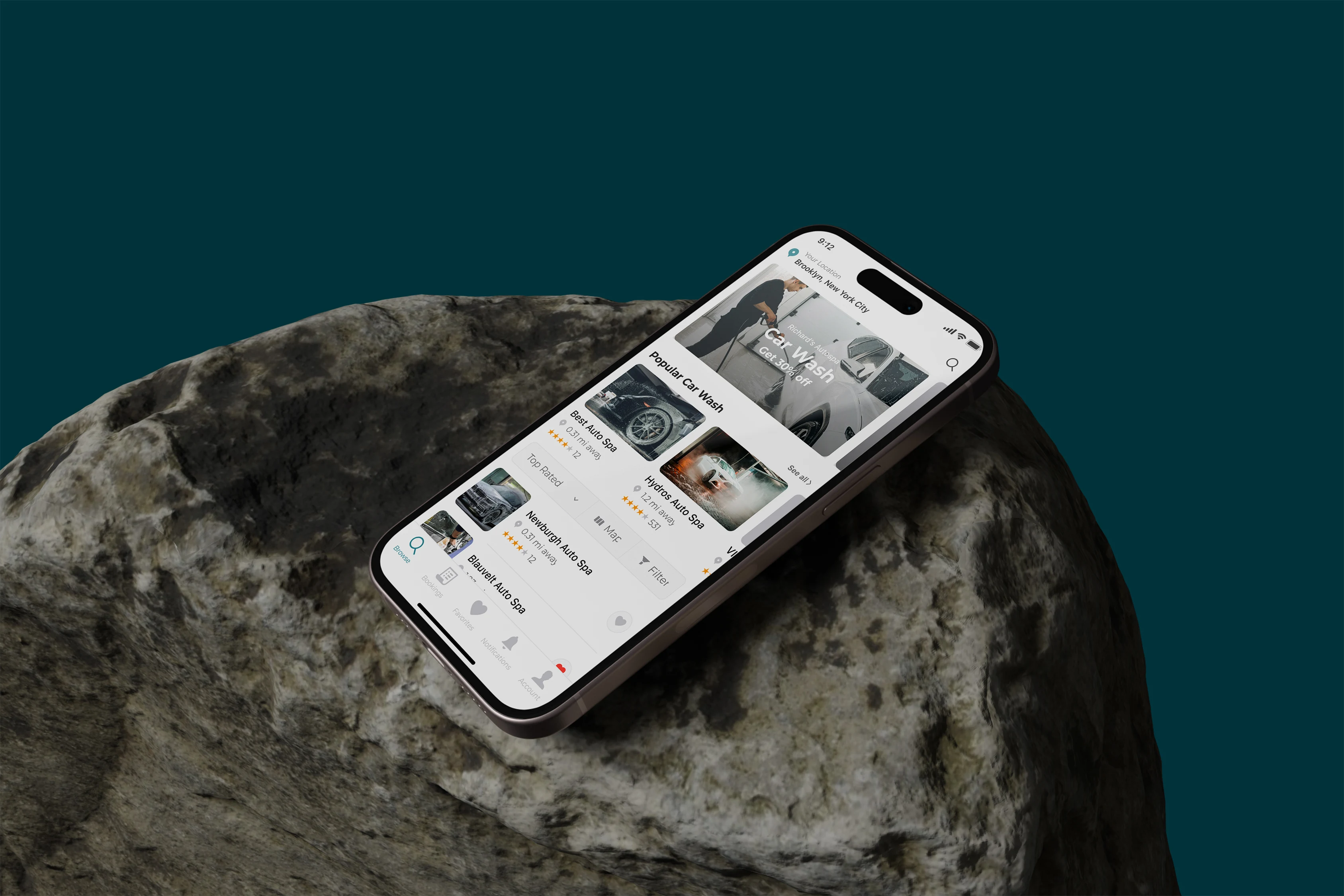
Washkaar is an on-demand car wash booking app we designed and developed from scratch. The idea was simple: make booking a car wash as easy as ordering a pizza. No phone calls, no showing up and waiting, no confusion about pricing. We took it from a blank Figma canvas to a live React Native app running on both iOS and Android, covering 32 screens across the full user journey.
The Problem We Were Solving
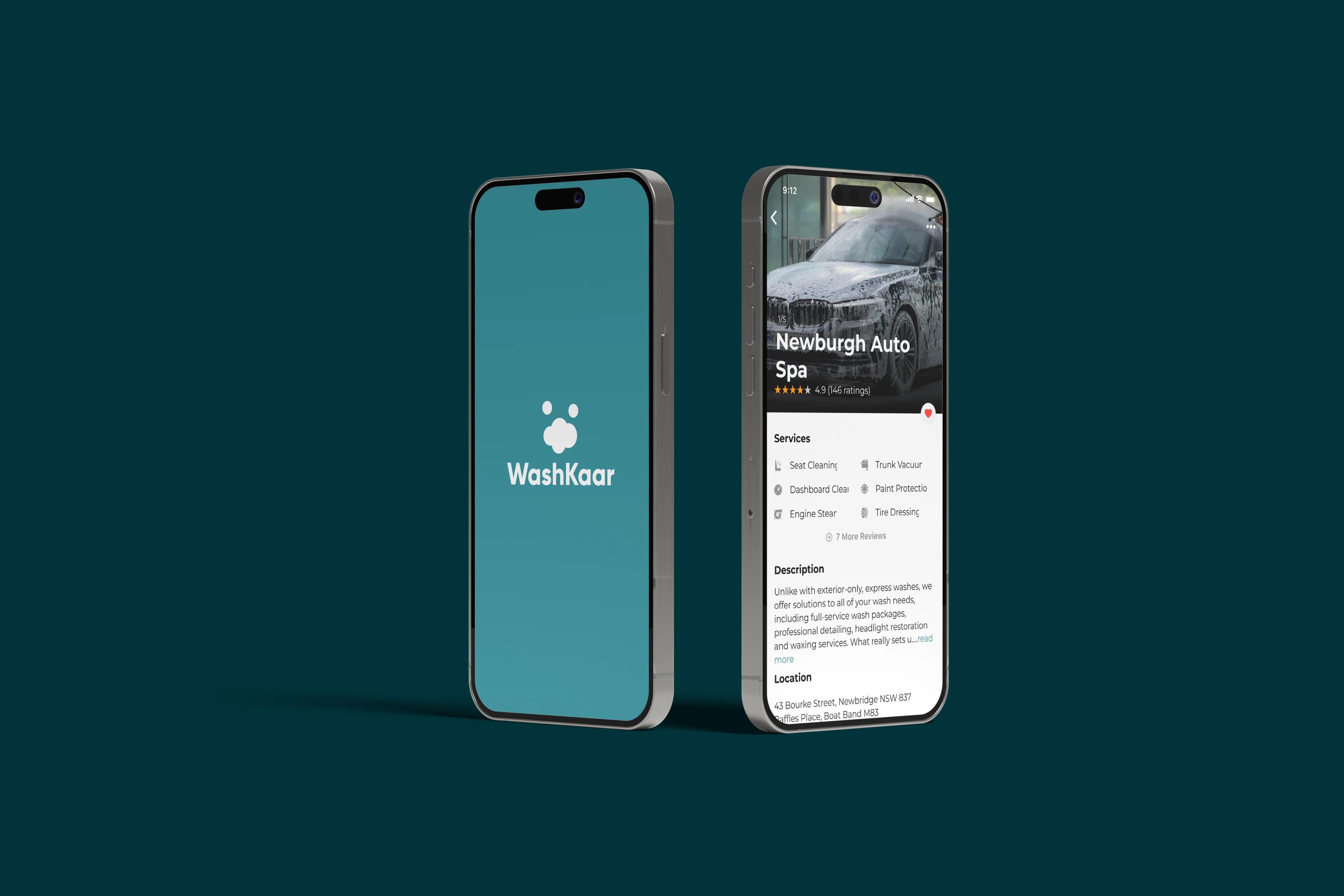
When we started working on Washkaar, car wash businesses were almost entirely offline. Customers had no real way to discover providers beyond driving past them or asking a friend. Booking meant calling ahead and hoping someone picked up. From the customer side, the pain points were clear: There was no way to compare providers, see their pricing upfront, or read reviews before committing. Scheduling was a guessing game. If you wanted a pickup or delivery wash, that was a whole separate conversation. And if something went wrong with your booking, there was no trail to follow. From the business side, things were just as frustrating. Providers had no digital storefront, no booking system, and no way to turn a one-time customer into a regular. Everything ran on memory, phone calls, and luck.
What We Built
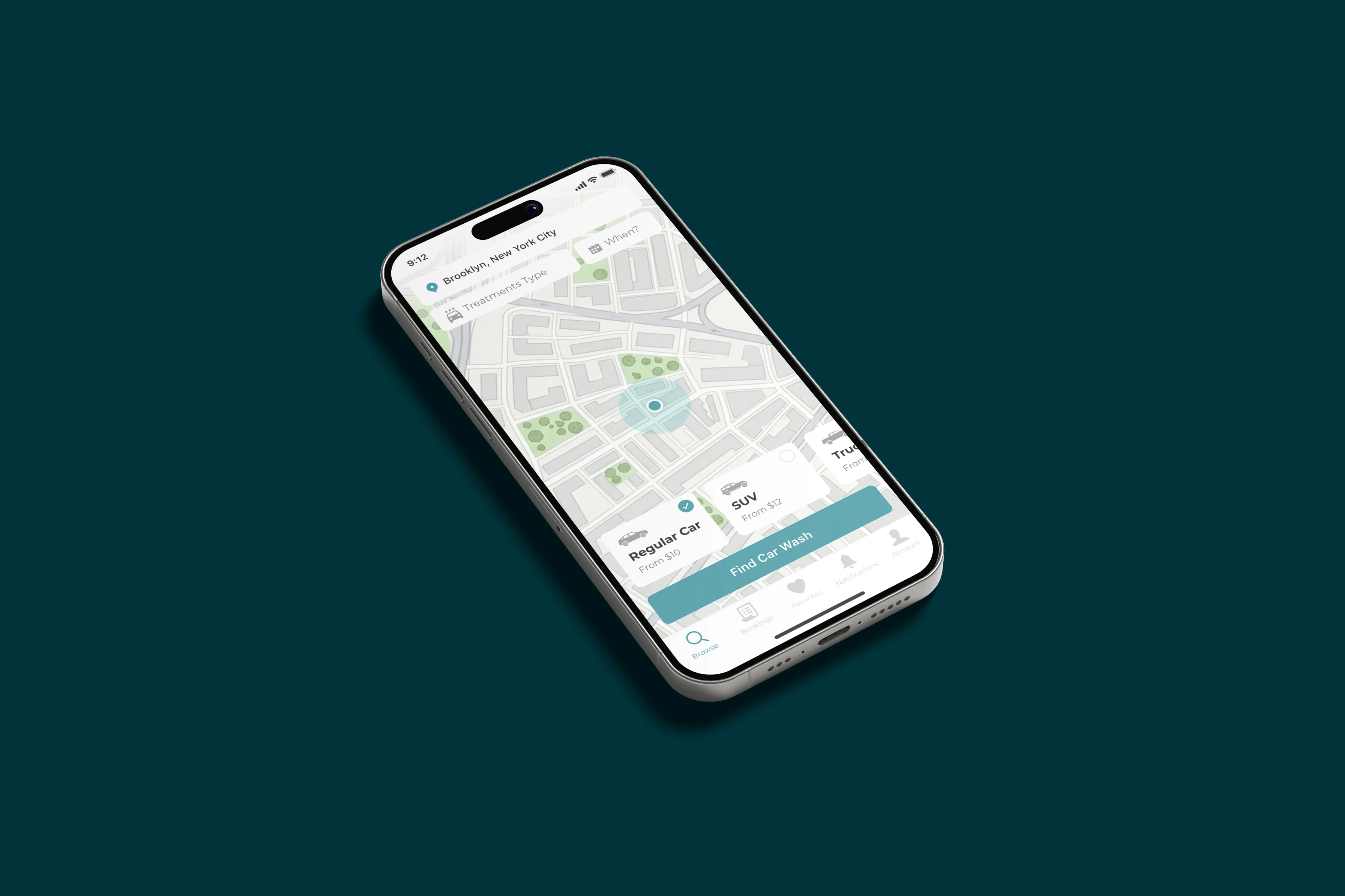
We built a map-first booking experience that handles everything in one clean flow. A customer opens the app, sees nearby car wash providers on a live map, taps into a service page with packages and pricing, picks a date and time, enters where their car is and where they want it delivered, reviews their booking, and pays. The whole thing takes less than two minutes. On the back end of that experience, there is a full account system, booking history, saved favorites, real-time notifications, and settings. Nothing was left out.
The Design Approach
We built the entire UI in Figma before writing a single line of code. That meant 32 screens, a complete component library, and a design system that kept everything consistent from the splash screen to the settings page. The teal and white palette was a deliberate choice. Car wash is a hygiene service. The brand needed to feel clean, fresh, and reliable without being clinical or cold. Teal hit that balance perfectly. Map-first discovery made sense because location is the first thing a customer thinks about when choosing a local service. Putting the map at the center of the browse experience meant users could orient themselves immediately. Splitting the pickup and delivery address into two separate steps was a small decision that made a big difference. It kept the flow clear for both drop-off scenarios and mobile wash scenarios without making either feel like an afterthought. The booking review screen before payment was intentional. Showing a full summary of the service, time, location, and price before asking for payment reduces drop-off and makes customers feel confident, not rushed.
UI/UX Design
Full User Journey, Figma Design System
Development
React Native, IOS and Android
Maps Integration
Live Maps, Location Search
Notifications
Real Time Push Notifications
What Made This Project Work
Washkaar worked because we treated it like a product, not a project. We thought about who was actually going to use it, what would make them trust it on the first open, and what would make them come back. The design and the development were never two separate tracks. They informed each other the whole way through, which is why the final product feels cohesive rather than like a design that got handed off and hoped for the best.
Needs a React Native App?
Let's Do it
Let's Do it

