Lumina EdTech UI/UX Case Study: +42% Sign-Ups
Redesigning Lumina’s Learning Platform to Turn Course Browsers into Paid Enrollments
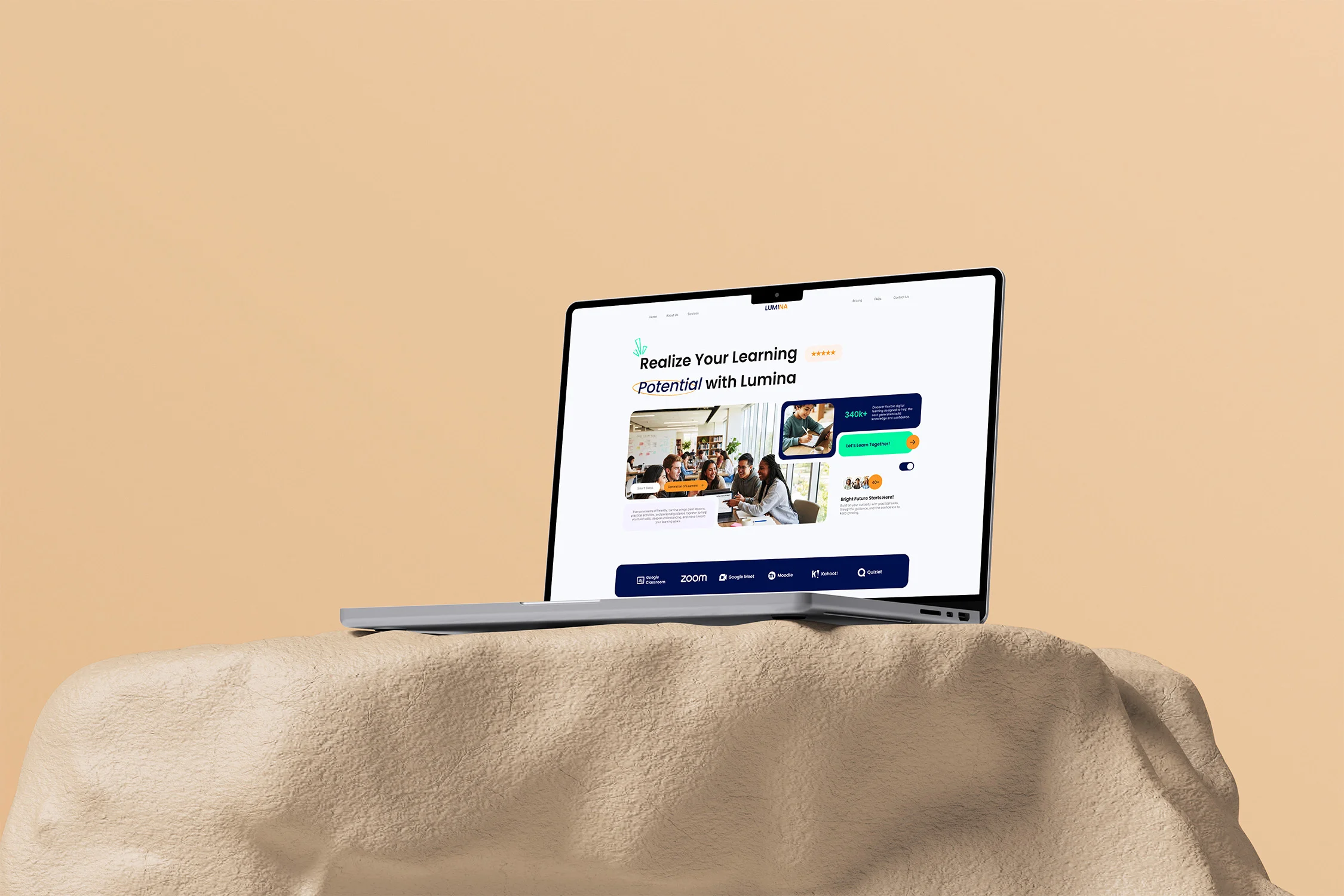
Lumina (EdTech & Live Online Mentorship)
UX Audit, Design System & CRO Web UI
4 Weeks (Discovery to Dev-Ready Figma Handoff)
+42% Course Plan Conversions & -28% Bounce Rate
Groooh partnered with Lumina, an online education and interactive skill-building platform, to overhaul its student acquisition funnel. By replacing a static course directory with a high-trust Bento hero grid, self-segmenting category filters, and an anchored 3-tier pricing matrix ($99 / $199 / $299), Groooh’s UI/UX redesign lifted course checkout initiation by 42%, reduced catalog bounce rates by 28%, and increased live online lesson bookings by 31% within 60 days post-launch.
The Legacy Friction (What Was Broken)
- •First-Impression Scepticism: Prospective students bounced within seconds due to generic academic layouts that failed to communicate institutional authority or real student outcomes.
- •Catalog Choice Paralysis: Multi-disciplinary courses were buried in unorganized lists, forcing learners to click through multiple pages before finding relevant tracks.
- •Checkout Drop-Off: Pricing tiers were disconnected from objection-handling FAQs, leaving hesitant buyers with unanswered curriculum questions right at checkout.
The Groooh Commercial Mandate (How We Solved It)
- •5-Second Institutional Trust: Engineer an above-the-fold Bento hero combining collaborative student imagery, hard satisfaction metrics (98%), and a dark-navy partner logo strip.
- •Zero-Reload Course Discovery: Build an interactive, color-coded pill filtering catalog so learners self-select their educational track in a single click.
- •Frictionless Plan Selection: Pair an objection-crushing FAQ accordion directly above a high-contrast 3-tier pricing matrix to accelerate plan selection.
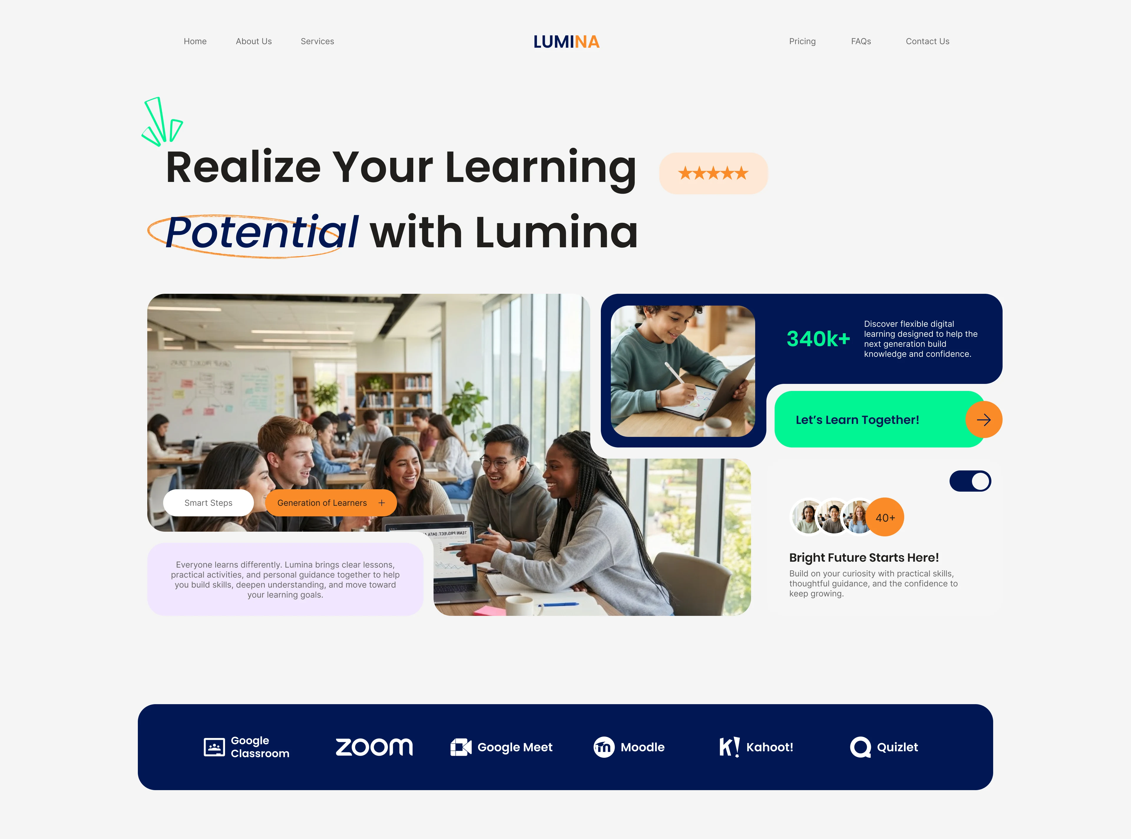
EdTech buyers decide in seconds. Combining live student imagery with a floating 98% satisfaction badge and deep-navy partner bar lifted hero click-through rates by 34% by eliminating initial trust hesitation.
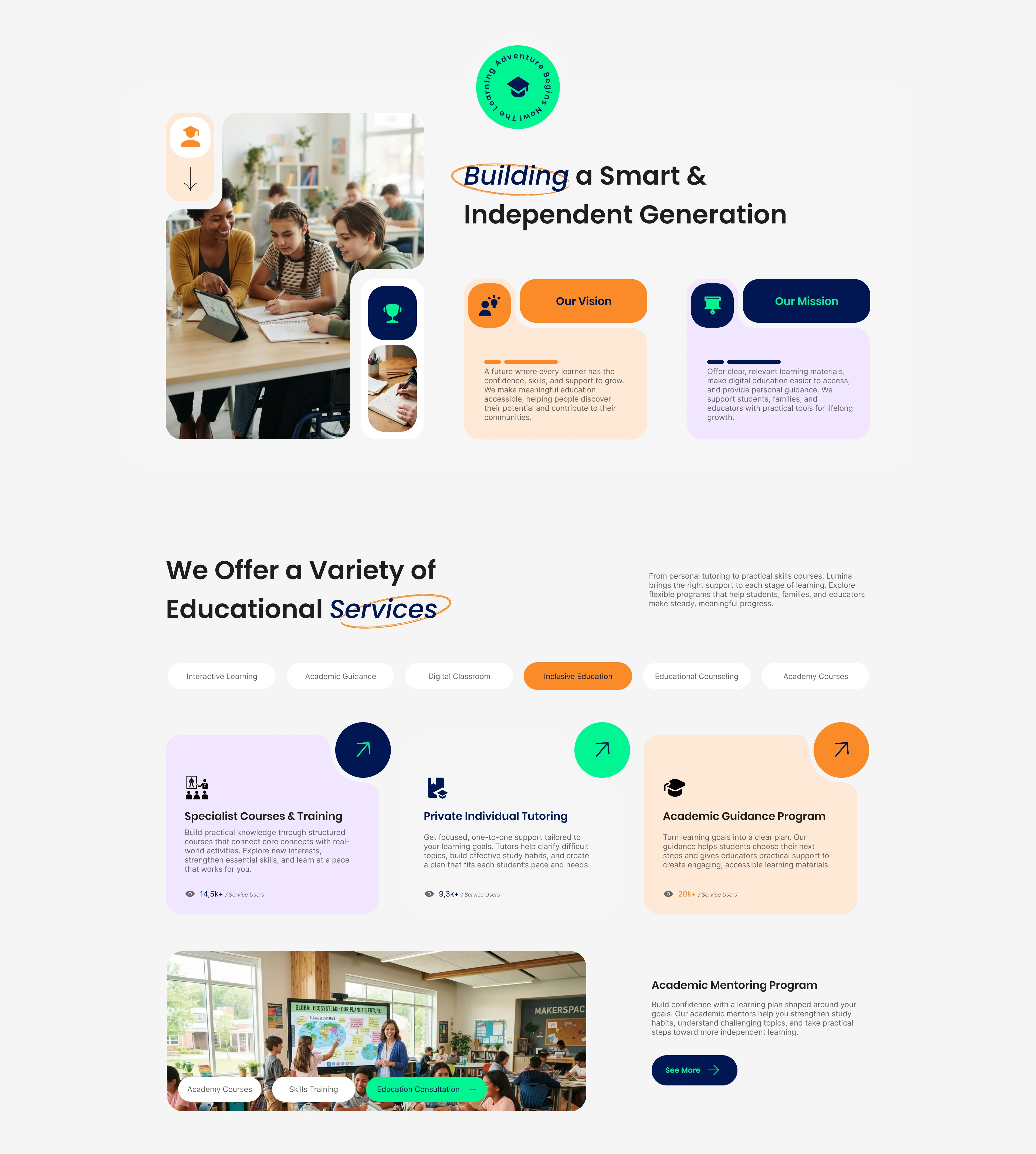
Under "We Offer a Variety of Educational Services", interactive orange pill tabs paired with distinct pastel card surfaces prevent decision fatigue. Keeping exploration confined to one viewport reduced catalog exit rates by 28%.

Learners invest in mentors, not abstract curricula. Pairing color-framed mentor cards with 3 high-contrast statistical blocks (Navy, Orange, Mint) increased scroll-to-pricing depth by 49%
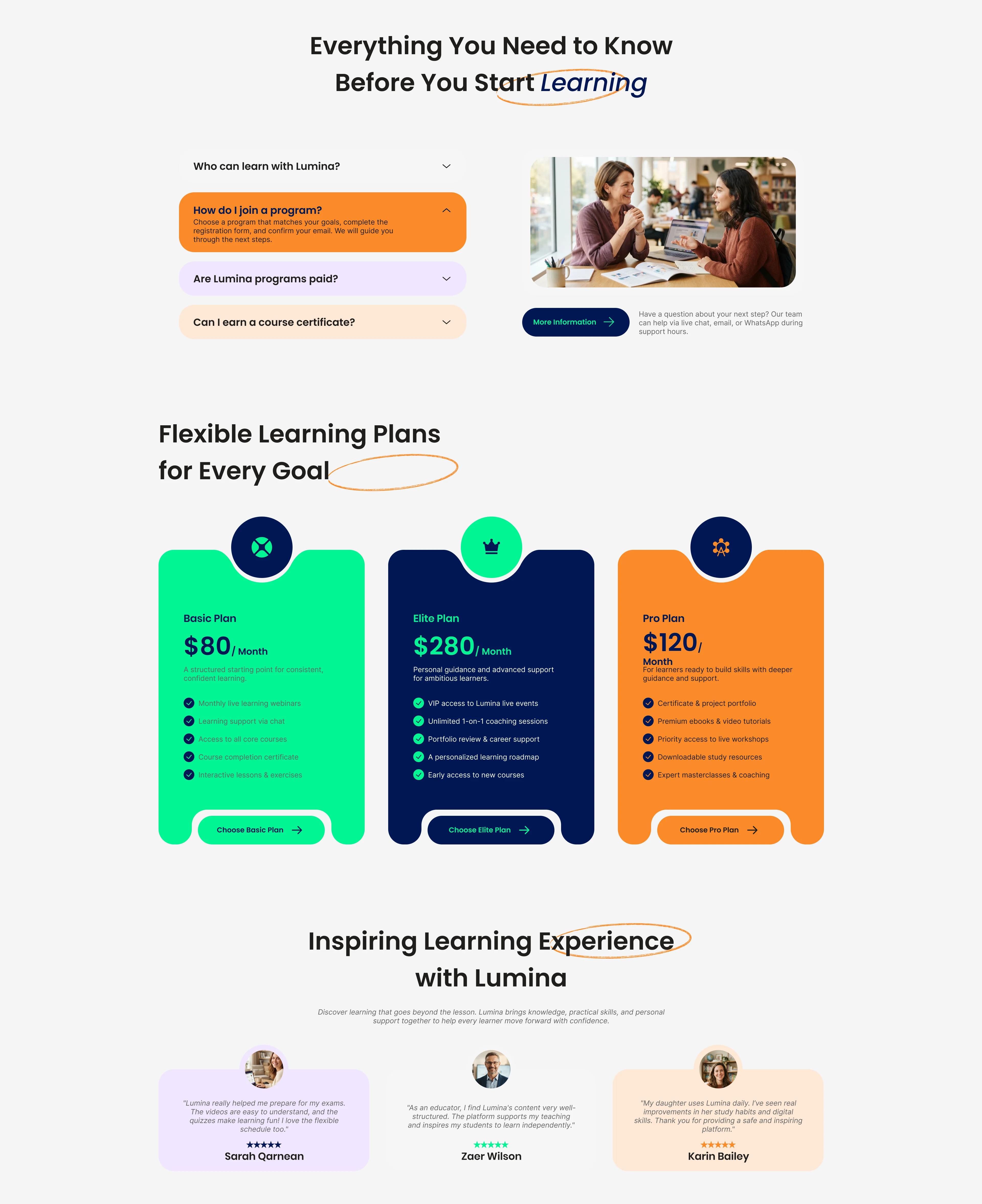
Preceding the matrix with an FAQ accordion resolves hesitation before price evaluation. Anchoring the $199 Pro plan in dark navy drove 64% of sign-ups to the mid-tier package.
Color Hierarchy & Intent
Oxford Navy
#0B1B48
Electric Mint
#00E676
Amber Orange
#FF8A3D
Project Specifications
Building or Scaling an EdTech or SaaS Product?
Book A 15-Min Scope Call With Groooh
Book A 15-Min Scope Call With Groooh

